Review: iOS 7 revamps interface of Apple devices
Apple’s latest software release for mobile devices, iOS 7, has caused both positive and negative reactions. Released Sept. 18, the update completely redesigned the interface, adding many new features.
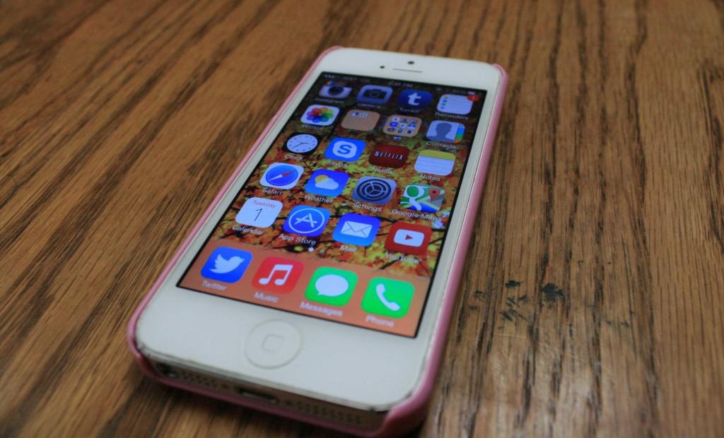
Some argue that the update is simply a shoddy copy of the Android interface. While some similarities are evident, iOS 7 is far more streamlined and aesthetically appealing. It includes an entirely new design, from app icons to detailed redesigning of the apps themselves.
The lock screen now comes without the obstructive bars across the top and bottom, leaving the lock screen features floating above the fully shown wallpaper.
The update also allows the user to swipe up from the bottom even when locked to reveal an extremely useful control panel, containing shortcuts to such features as airplane mode, WiFi connectivity, Bluetooth connectivity, Do Not Disturb mode, portrait orientation lock, screen brightness, music volume and playing, AirDrop, and AirPlay. It also contains shortcuts to flashlight, timer, calculator, and camera apps.
Swiping down from the top reveals a newly designed notification center. In the “All” tab, it shows the classic notifications such as in iOS 6. The “Today” tab shows reminders, calendar events, the date, and weather for the day. The “Missed” tab shows notifications that were not checked upon receiving them.
Aesthetically, iOS 7 is revolutionary. Intricacies are everything in this beautifully designed update, down to increasing its three dimensionality, which can be seen when the user tilts the phone back and forth on the home screen, and the apps shift to accommodate the slight change in orientation. This three dimensionality is also shown in the redesigned tabs in Safari. As the user tilts the phone up or down, the tabs show more or less depending on the direction it is tilted.
The app icons now have a matte finish rather than the glossy finish that has been used in previous versions of the software. This adds a minimalistic feel to the user experience.
iOS 7 also features entirely redesigned typography. It now opts for an extremely light Helvetica Neue, as compared to the far bolder font in previous versions.
The entire device’s color scheme is also now completely connected to the colors of the device’s wallpaper. It takes the colors of the wallpaper and connects them to the colors of folders, the notification center, and the bottom control panel. This creates a much more custom interface.
Overall, iOS 7 is a brilliant new Apple interface allowing for personalization and accessibility. The new interface is modern, minimal, and masterfully designed.